General Settings is the single screen that defines your widget's identity and appearance: where it runs, what it says, which color it uses and how wide it opens. Filling this in before moving to modules makes the live preview at the bottom right accurate. This guide walks through every field in order.
You open the page from My Add-ons → UC Action Hub. Changes go live the moment you press Save and Publish; you never re-add the code.
1. Identity: widget name, domains and titles
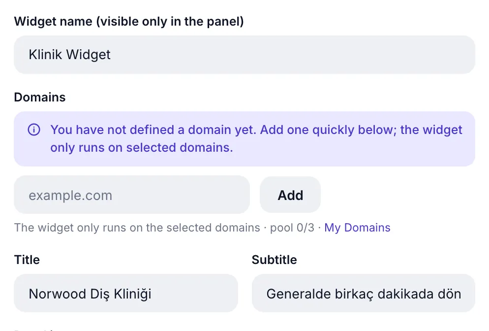
Widget name is panel-only; visitors never see it. It exists to tell your widgets apart ("Clinic Widget", "Campaign Widget").
Domains is a security lock: the widget only opens on the domains you tick here. Even if your code is copied to another site, it will not run. You can add a new domain from the box below it (as example.com, without https://).
Title and Subtitle are the texts at the top of the widget window. The title is your business name ("Norwood Dental"), while the subtitle is ideal for managing expectations ("Usually replies in a few minutes").
| Field | Limit | Default | Note |
|---|---|---|---|
| Widget name | 60 characters | Widget | Panel only |
| Domains | Free 1 · Pro 3 | — | At least 1 required |
| Title | 40 characters | Contact | Window headline |
| Subtitle | 60 characters | empty | Thin line under the title |
2. Window image: 53 preset icons or your own logo
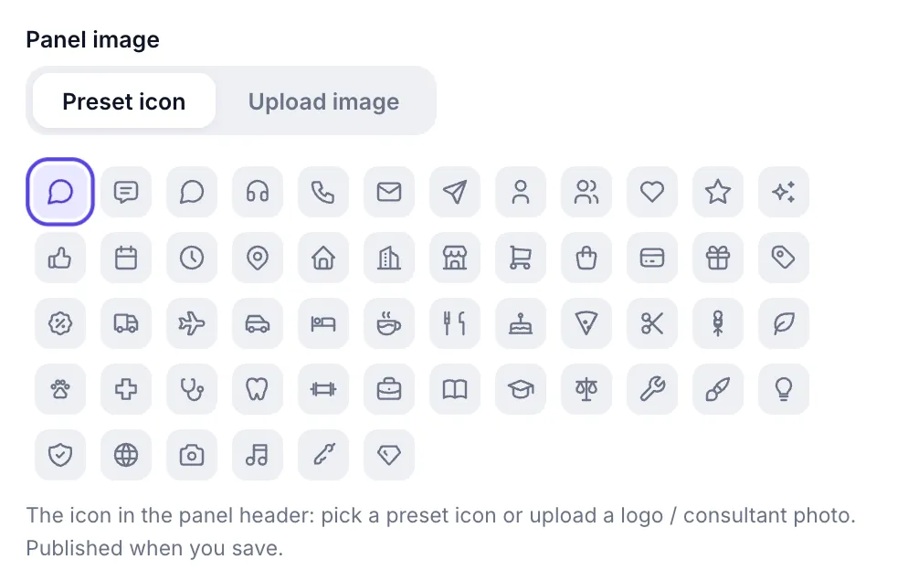
This sets the icon next to the window title. There are two options:
- Preset icon: 53 icons grouped by industry (Message, Support, Calendar, Tooth, Clinic, Restaurant, Salon, Legal, Education, Shipping, Hotel, Camera...). The default chat bubble is the first tile.
- Upload image: upload your logo or an advisor photo. Drag and drop is supported.
| Setting | Values | Limit |
|---|---|---|
| Preset icon | Default + 53 icons | — |
| Upload image | JPG, PNG, WebP | 2 MB max |
3. Welcome message, form language and font
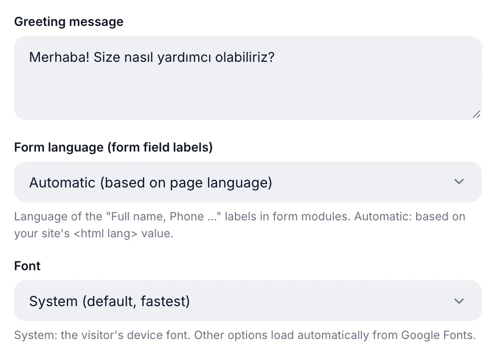
The welcome message is the sentence shown at the top when the window opens (up to 300 characters). Keep it short and inviting: "Hello! How can we help you?"
Form language sets the language of field labels ("Full name", "Phone"...) in the Form/Booking/Complaint modules:
| Option | Behavior |
|---|---|
| Automatic | Follows your site's <html lang> value (default) |
| Türkçe / English / Deutsch | Fixes the language regardless of the page |
Font matches the widget to your brand: System (default, fastest, the visitor's device font), Inter, Sora, DM Sans, Poppins, Arial. Anything other than System is loaded automatically from Google Fonts.
4. Theme, country code and color
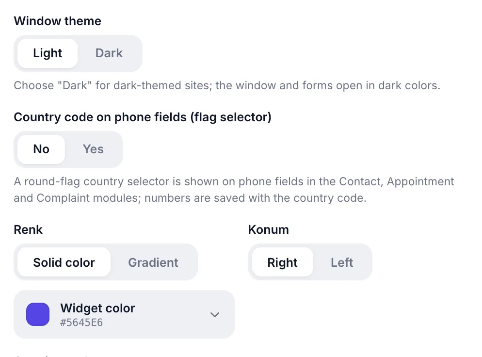
Window theme
Light (default) or Dark. If your site is dark-themed, pick "Dark"; the window and forms open in dark colors.
Country code in the phone field
When enabled, the phone field in the Form, Booking and Complaint modules shows a round flag country picker, and the number is stored with its country code. It has two extra settings:
- Show flags: when off, only the dial code (+90) is shown instead of a flag. Flag emojis may not render on Windows desktop; turn this off for a plain look.
- Country list: All countries (203) or Only selected countries. With the latter you search the list and tick only the ones you serve; the list is searchable by both name and dial code.
Color and gradient
The widget's main color applies to the bubble, the header and the buttons. There are two modes:
- Solid color: a single color. Pick from 16 presets or enter your own.
- Gradient: a transition between two colors. Click one of the 6 preset pairs to set both at once, or choose the second color yourself.
Opening the color picker reveals three parts: a Default row at the top (WhatsApp green · #25D366), a 16-color palette below it, and a custom picker at the bottom — color area, hue bar, opacity bar and hex box. Lowering opacity stores the color as transparent in #rrggbbaa form.
Position
Choose whether the bubble sits in the Right (default) or Left bottom corner. If something else already lives at the bottom right of your site (like a back-to-top button), move it left.
5. Opening style, size and timing
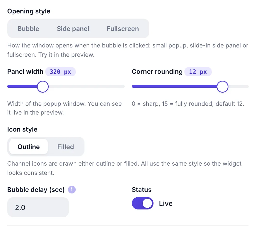
Opening style defines how the window opens when the bubble is tapped:
| Option | Behavior | When |
|---|---|---|
| Bubble | Small popup in the corner (default) | Ideal for most sites |
| Side panel | Panel sliding from the edge | Long form/booking flows |
| Full screen | Covers the screen | Mobile-heavy, single-focus flows |
The remaining four settings cover size and timing:
| Setting | Range | Default | What it does |
|---|---|---|---|
| Window width | 280 - 420 px | 320 px | Window width on desktop |
| Corner radius | 0 - 15 | 12 | 0 = sharp corners, 15 = roundest |
| Icon style | Outline / Filled | Outline | How channel icons are drawn; all share one style |
| Bubble delay | 0 - 20 s | 2 s | When the welcome bubble appears (0 = instantly) |
The Status switch next to them publishes or disables the widget entirely. When off, the widget is not drawn even if the code stays on the site.
6. Hiding the branding link Pro

Removes the "Powered by UC" link under the widget. On the free plan the switch appears locked; it unlocks when you move to Pro.
7. Install: adding the code to your site
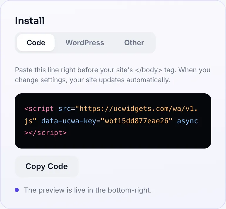
The Install card on the right has three tabs.
Code
Copy the single line and paste it right before your site's </body> tag:
<script src="https://ucwidgets.com/wa/v1.js" data-ucwa-key="YOUR-KEY" async></script>This code is added once. Every change you make in the panel appears on the site automatically; you never paste the code again.
WordPress
No coding needed: download the plugin, then in WordPress go to Plugins → Add New → Upload Plugin, upload the zip and activate it. Your widget key ships embedded inside the plugin, so no extra setup is required.
Other platforms
Step-by-step instructions for Wix, Squarespace, Shopify, İkas, Ticimax, IdeaSoft and Google Tag Manager live in this tab. Each one walks you through the menus to reach the right place to paste the code.
Saving and what comes next
- Press Save and Publish. Settings are stored and the site updates instantly.
- Check the live preview. The real widget runs at the bottom right; try the color, width and opening style there.
- Move on to modules. General settings are done; next comes which channels to enable.
All Pro features open for 14 days; no card required.
Start FreeAll Pro features free for 14 days; no credit card, live with a single line of code.
Explore UC Action Hub